

A Meaningful Foundation.
Family-owned and -operated, Westland’s long legacy of homebuilding began in Vancouver with high-end single-family homes. Across their 15-year history, they have gained an appreciation for design excellence, craftsmanship, and integrated technology.
Visit Website:
WestlandLiving
Client:
Westland
Product:
Responsive Website
Software:
Figma
Timeline:
3 weeks
Role:
Lead UI Designer
The
Challenge
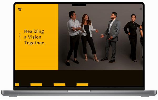
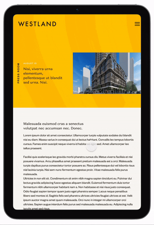
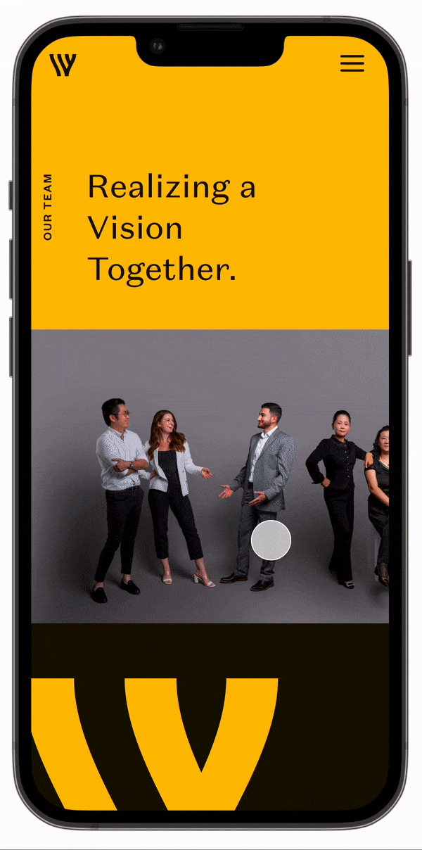
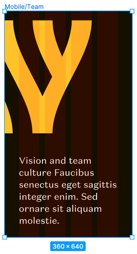
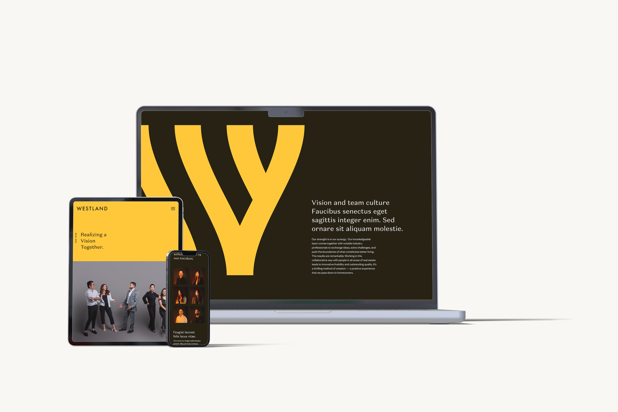
The challenge was to add the responsive Teams and Blog Post pages to Westland's website. Enhancing the team page to include more consultants while also designing multiple sample blog post page versions for the client.
Design Solution
I reviewed the newly renewed Westland website by going through all the existing functionalities and analyzing the overall look. Using the specified breakpoints, I then created responsive designs for desktop, tablet, and mobile devices for the Teams and Blog Post pages. I prepared all the assets for the Dev team and created a prototype for the design hand-off in advance of our meeting. Once the mockups were complete, I held the design hand-off meeting with the assigned web developer, during which I provided detailed design specifications and user interaction explanations. Once the Netlify app was ready, I reviewed the pages and addressed any issues in the Internal Quality Assurance - QA process to ensure the design was aligned with the intended version.
100% responsive compliance
across 3 breakpoints (desktop 1760px, tablet 768px, mobile 350px) — zero post-launch layout issues
the impact
First-pass approval from client
responsive designs for 2 new page types approved without revision requests
3-week delivery timeline
delivered Teams and Blog pages from design to launch, 40% faster than typical 5-week agency standard
Style Guide
⌜
⌟
Style Guide ⌜ ⌟
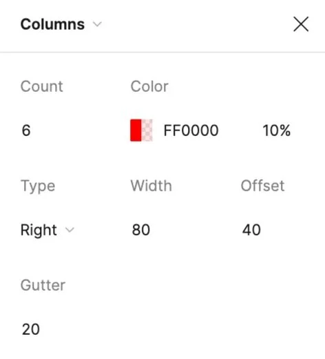
I have created a comprehensive UI Style Guide that includes information on the global Westland brand colours, typography, various components and assets, and icons. This guide was prepared to be a reference for the development team to ensure consistent branding and design across the website.
Overall, the purpose of this style guide was to provide a consistent visual identity for the Westland brand and ensure that all design elements on the website align with the brand's guidelines.
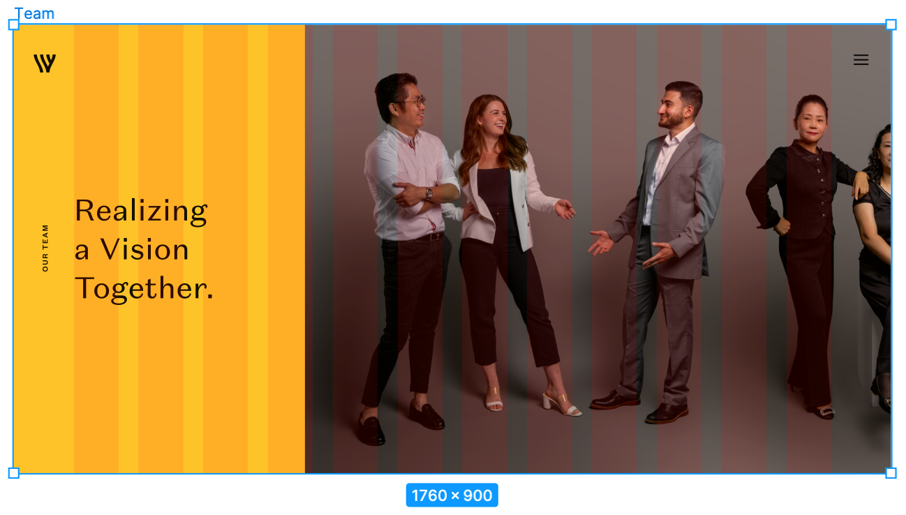

Desktop Breakpoints:
1760 px
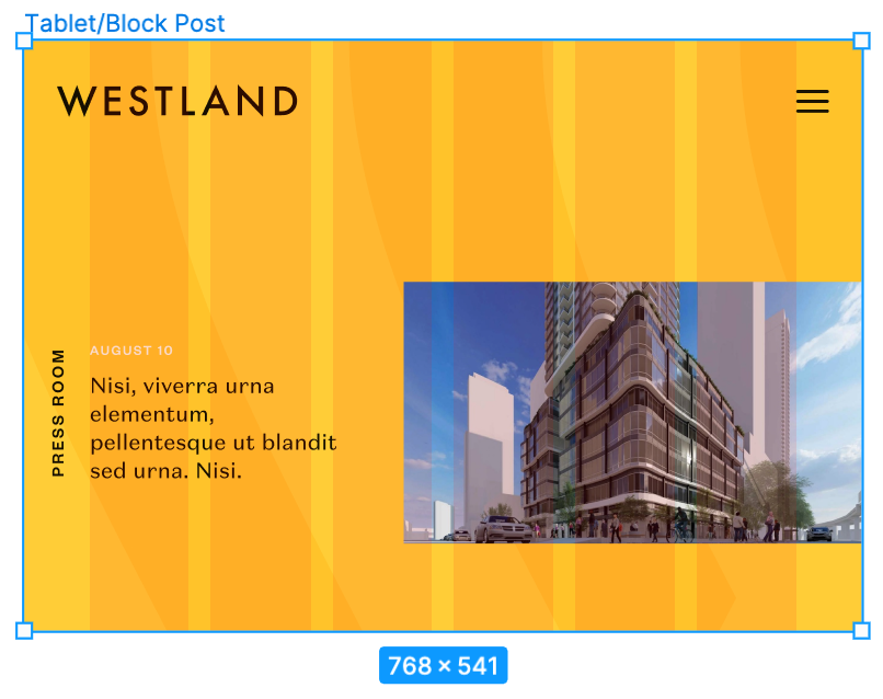
Tablet
Breakpoints: 768 px
Mobile
Breakpoints: 350 px
Design Hand-off
I ensured the mockups I designed were responsive and would work well on different devices. I also worked closely with the assigned developer to review the design and ensure everything was clear and ready for development. To help facilitate smooth communication and collaboration, I created a design system that included guidelines for how different design elements should be used and named all of the components in the design. I also exported the necessary assets in the correct sizes for the development team to use. Before our hand-off session in Figma, I created a prototype and added comments to the design file to explain how users should interact with the design.
This was meant to help the development team better understand and implement the design correctly.
Design QA
I conducted a thorough internal quality assurance review and testing of the Netlify app to ensure that it met all requirements. I used both the BrowserStack app and the Viewport Resizer Google extension in Google Chrome and Safari to test the app on different devices. During this process, I identified any issues I encountered and documented them in a QA sheet, including the type of issue, its severity, and whether it was critical for launch.
After the developer made the necessary fixes, I conducted a secondary review to confirm that all issues had been resolved.
Conclusion
I presented the final prototypes of the Teams and Blog Post pages to the Westland client after they had undergone external quality assurance testing. The client was happy with the results and gave their approval to go live. Our dev team then successfully launched the two pages.
Key Learnings
One of the biggest challenges I faced in this project was designing new pages for an existing website that had been originally created by another designer. I had to ensure that the new pages maintained a consistent style with the
rest of the website.
Initially, the idea of following an existing design seemed straightforward, but it turned out to be more challenging than expected, particularly when it came to designing for responsive screens.
There is no specific guidelines for layout spacing in design, especially in responsive web design. Therefore keeping the design consistent and similar to the other pages was difficult.
Taking over a project from someone else is hard. However, my experience with this project taught me that understanding the client's needs is essential before starting a project. This would help me understand the rationale behind the existing design.