


Visit Website:
Product:
Responsive Web Design
Software:
Figma, Adobe Illustrator, ImageOptim
Role:
Lead UX/UI Designer
The Challenge
As the lead UX/UI designer of the project for Brush\Watson, my primary responsibilities contain an end-to-end design process, beginning with a comprehensive marketing analysis to understand our target audience and our client's specific goals. Leveraging this data, I was then able to outline an effective design and development plan, focusing on creating a responsive web design that would seamlessly function across various platforms.
DISCOVERy
UX Competitive Analysis
To perform a thorough competitive analysis for the Brush\Watson project, my initial step was to identify key competitors in the field and closely examine their online presence. Due to the time constraint, doing the analysis on competitors’ websites would be the most efficient way of finding their strengths and weaknesses in order for me to plan my design decision.
I engaged in a comprehensive usability testing process of Alberni 1881, Joseph Arnold, and Sailboat Real Estate Websites to measure their effectiveness in various parameters such as ease of navigation, use of white space, registration form, load time, image and button interactions, and responsiveness.
I used Figjam to synthesize my findings.
DEVELOPment
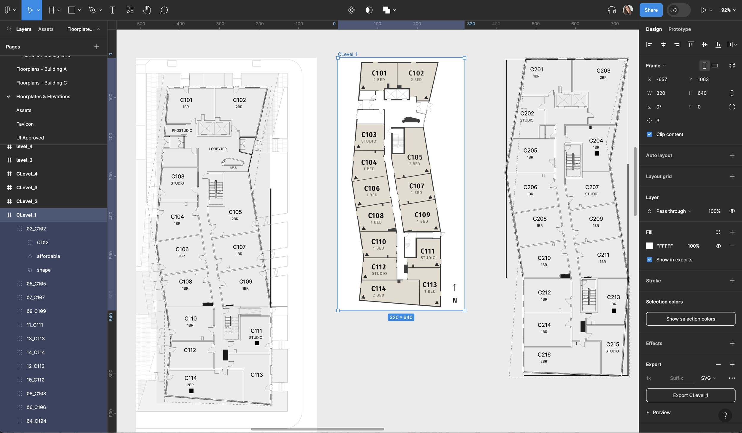
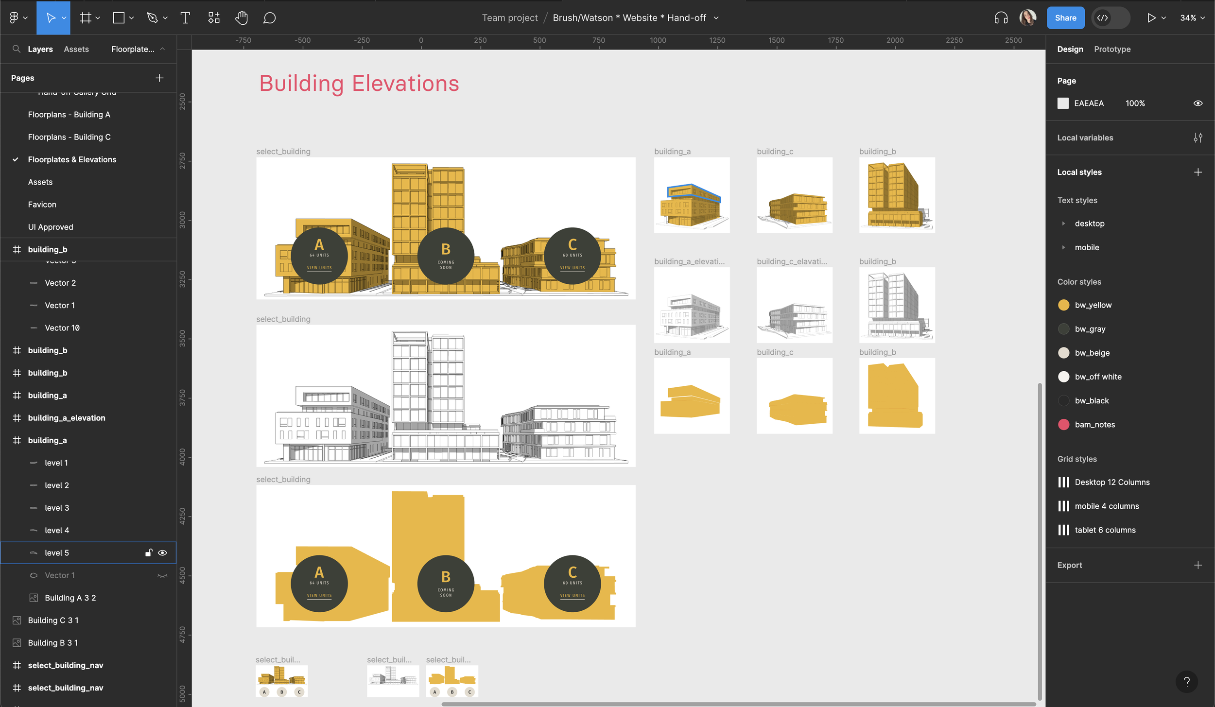
With its visual representation of the site's structure, the sitemap enabled the entire team, including developers, designers, and stakeholders, to understand the project's scope and direction more effectively. It also allowed for early detection and resolution of any potential issues with the site's architecture.
I designed a sitemap for the Brush\Watson website project to plan out the website's structure.
EARLY DESIGN STAGE
I proposed an interactive map to showcase the neighbourhood and nearby amenities. However, our front-end developer was concerned about this feature's complexity and potential performance issues. They suggested a simpler, static map with annotated points of interest as an alternative.
🤔
As the lead UX/UI designer for the Brush\Watson project, I faced a challenge involving the design of an interactive map feature for the website.
PRODUCTION
CLIENT PRESENTATION + FEEDBACK
Once the production work was complete and all assets were created, I designed the first version of the website to present to the Brush\Watson client.
The presentation was centered around an interactive prototype built on Figma, which served as a dynamic showcase of our design efforts.
I began by giving an overview of our process, including the competitive analysis, the sitemap, and how these fed into our design decisions. Moving on to the prototype, I provided a real-time, interactive walkthrough of the website, demonstrating its functionality, design elements, and user flow. The interactive nature of the Figma prototype allowed the client to virtually 'click' through the site and experience it from a user's perspective.
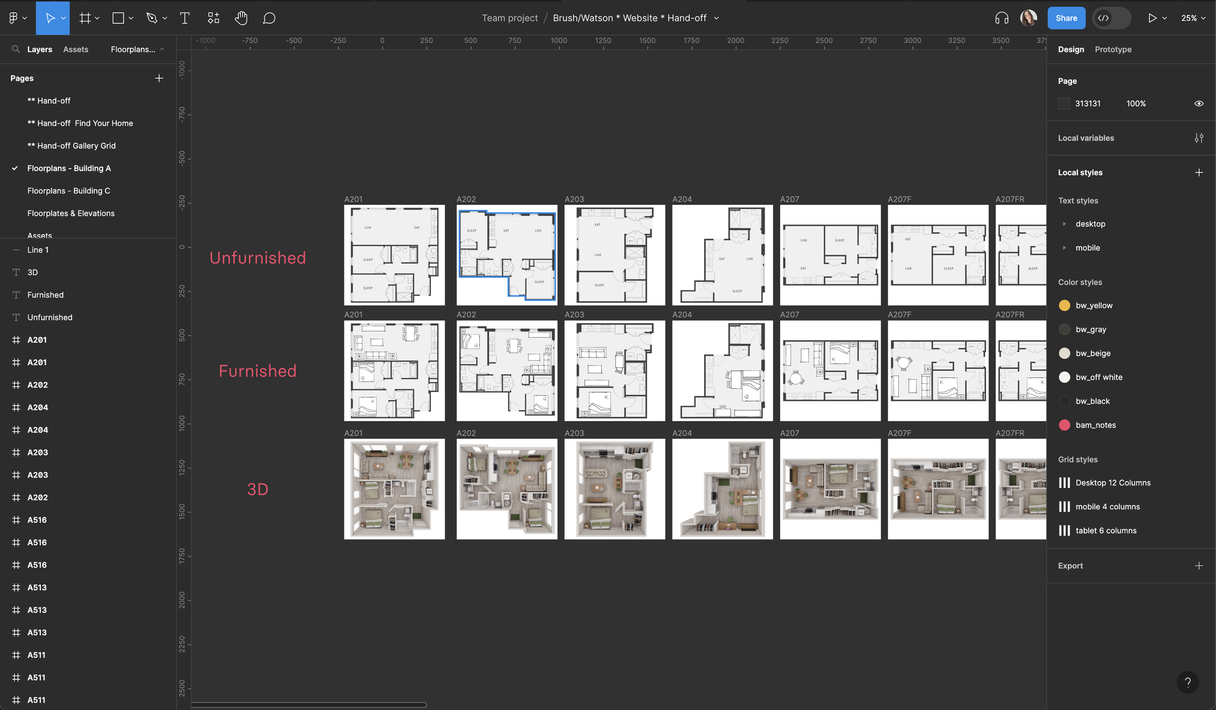
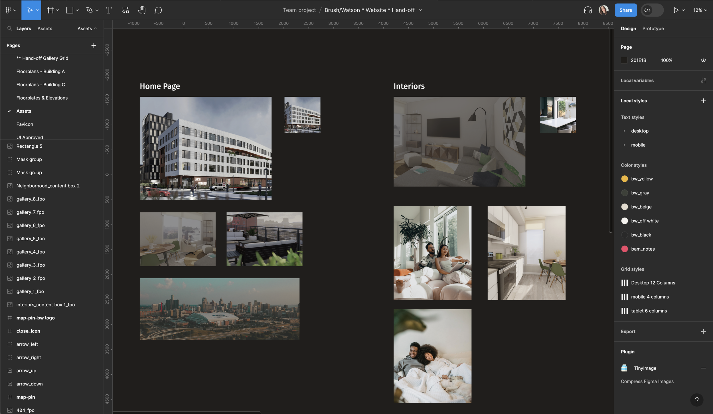
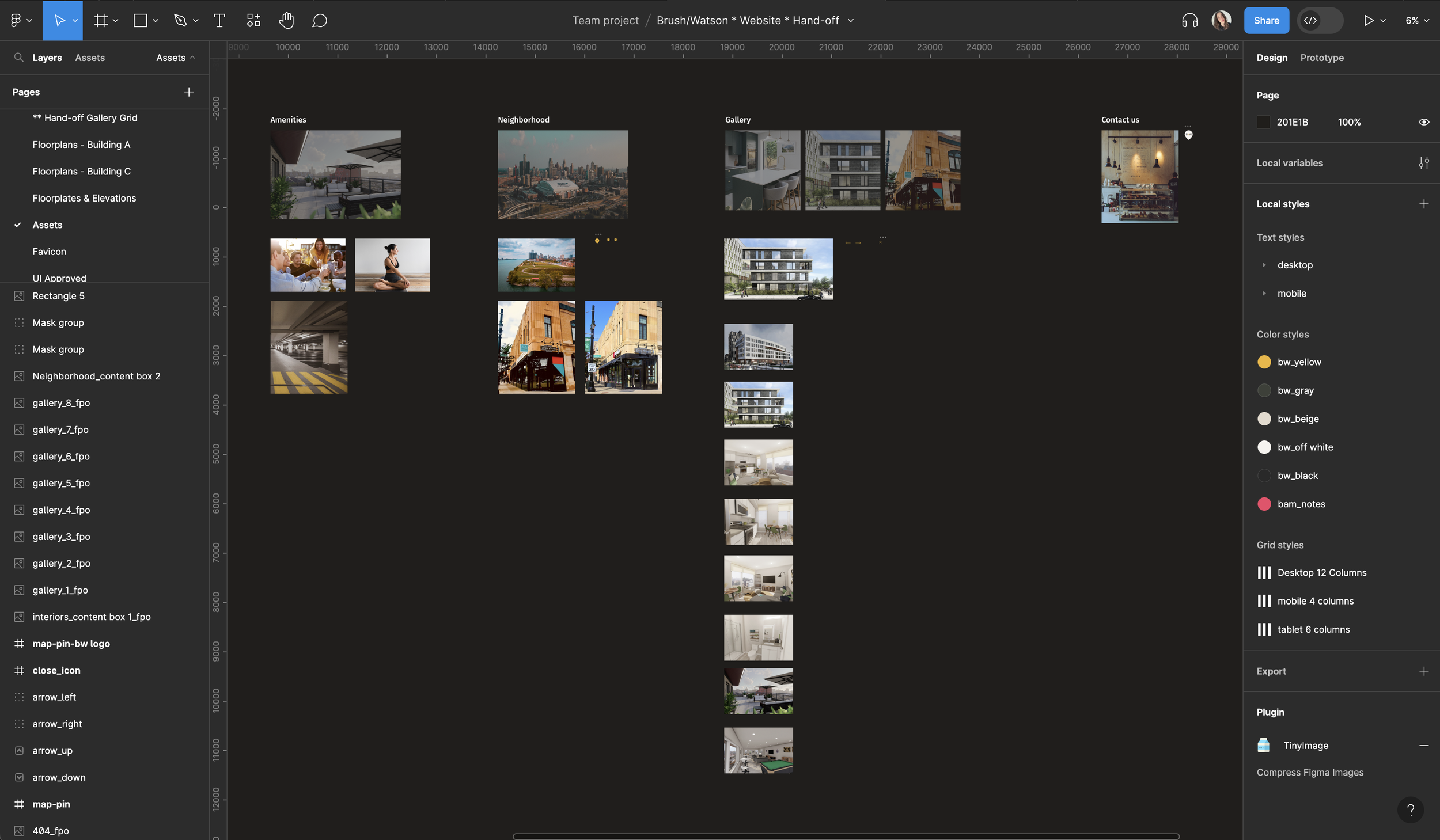
DESIGN HAND-OFF
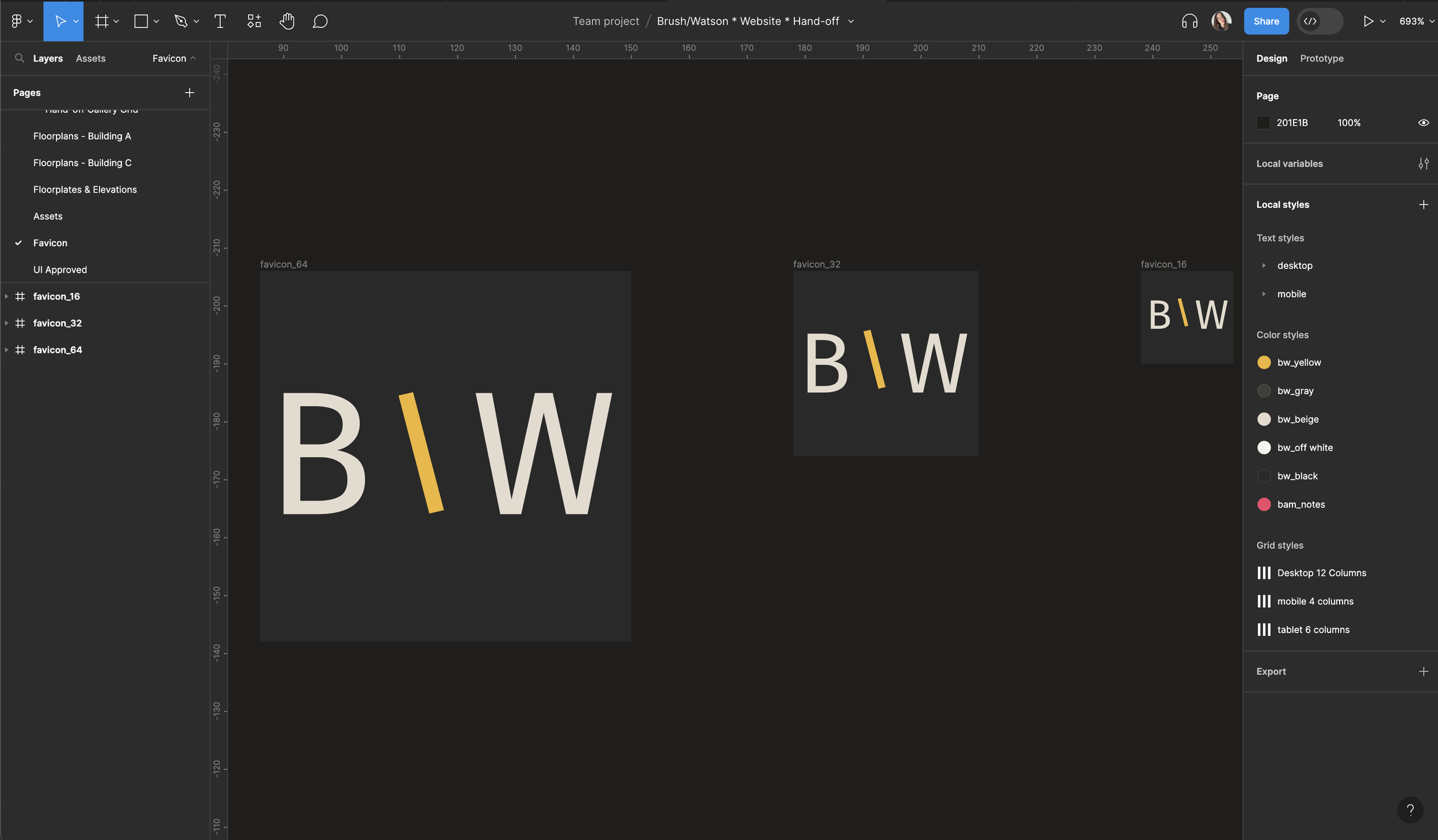
I created a UI Style Guide that contains all the assets related to the Brush\Watson website’s user interface.
This style guide includes typography, brand colours, buttons, cards, and components that are approved to be used in accordance with brand guidelines.
This style guide would also serve the DEV team as a reference for ensuring consistent branding and design throughout the portal.
I completed the design of responsive mockups and coordinated with the front-end developer and the project manager to have a design hand-off session together. To ensure smooth, clear and transparent collaboration, I prepared the design system, named all components, and exported assets in the appropriate sizes. Prior to our hand-off session in Figma, I created an interactive prototype and added comments on the design file for certain interactions to clarify user interactions for the dev team to review.
INTERNAL AND EXTERNAL QA
After receiving the Netlify app from the developers, I performed internal quality assurance reviews and testing to ensure the final product met the requirements. This included interactions, alignments, spacing, assets, etc. I reviewed each device using the BrowserStack app and Viewport Resizer Google extension in Google Chrome and Safari.
I identified the issues I found in a QA sheet where I specified them by their issue type, severity and whether it was critical for launch. After developers made the necessary changes, I conducted a secondary review to verify that all issues had been resolved. The final product was then reviewed by the Project Manager to ensure it met all requirements and was ready for client quality assurance.
Brush\Watson client was particularly impressed with the overall design. They expressed their satisfaction with how the design aligned with their brand identity while prioritizing usability. Their approval not only validated our design approach but also served as a green light to proceed to the launching phase of the full website.
impact
Brush\Watson was met with very positive feedback from both the client and its users.
The website features bright colours, textures, and a positive use of white space making the site feel fresh, clean, and approachable.
The challenging part of designing the website was creating a well-structured sitemap to visualize how each page links to each others for easy navigation.
Focusing on the user flow I identified the pain-points in the home searching process and used the findings to create a site architecture and navigation to enable easier browsing and a frictionless experience for the user.
1m 54s
85% above real estate industry benchmark, indicating strong content engagement
Average Session Duration:
20%
Exceeding industry standard of 2-5% for luxury real estate websites
property inquiry conversion rate:
78%
Strategic content placement and responsive design achieved 6.8% vs. 35% competitor average
reduction in bounce rate:
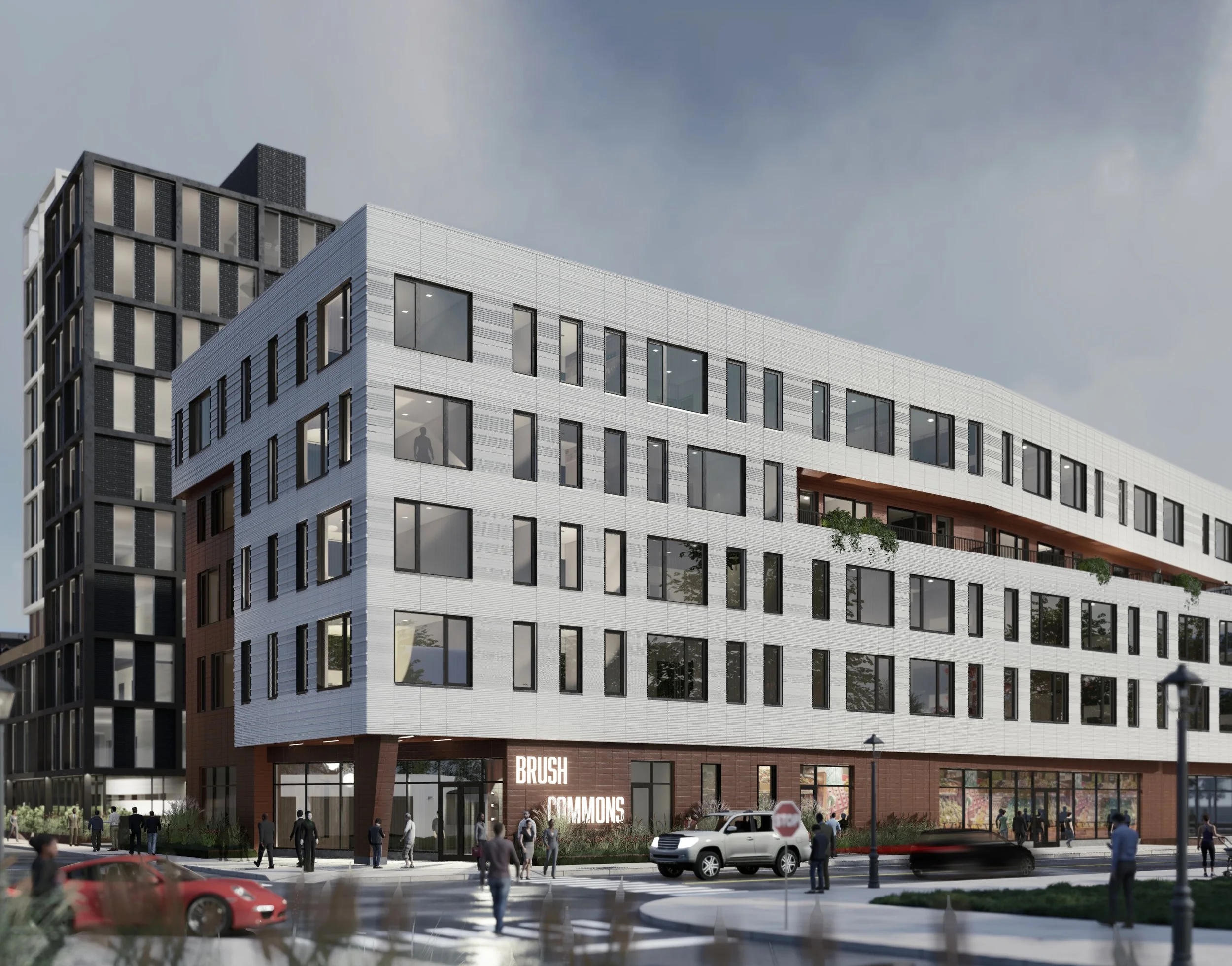
FINAL PRODUCT
Key Learnings
Importance of Clear Communication:
Shared Understanding: Every team member needs to understand the project's goals, timelines, roles, and responsibilities. Clear communication ensures everyone is on the same page and minimizes misunderstandings that could derail the project.
Efficiency and Productivity: When communication is clear, team members can work more efficiently. They know exactly what is expected of them and can focus on their tasks without confusion or delays.
Innovation and Problem-Solving: Open and clear communication fosters a collaborative environment where ideas can be freely shared and explored. It encourages team members to bring up potential issues or innovative solutions, leading to better problem-solving and creativity.
Team Morale and Trust: Clear communication builds trust among team members. When communication is open and transparent, team members feel valued, heard, and included, which boosts morale and fosters a positive work environment
In the Brush\Watson project, for instance, clear communication was key when addressing concerns about the proposed interactive map feature. In the early design stage, I was able to discuss potential issues with my team member - the front-end developer and adjust the design proposal accordingly to avoid any issues during the hand-off stage.
Planning & Developing:
One key learning from this project is the importance of comprehensive planning and strategizing in UX/UI design. Through designing the sitemaps and user flows, I was able to create a website that was not only visually appealing but also easy to navigate.
This project reaffirmed the power of user-centred design and the pivotal role it plays in creating successful digital experiences.