

Helping dog parents build habits in managing and maintaining their dogs’ needs.
We Paw Your Back!
Why Waggy?
As a dog owner myself, I always think that dogs deserve a happy fulfilled life where they get to go to dog parks to socialize and see as many different places as they can.
We should always remember that, “Dogs might be in just a small part of our lives, but to them we are their whole life.”
However, at the end of the day we are all humans. There are times that we realize, we don’t have enough experience to manage our dog care, or forget about small things that relate to that. Therefore, in this project my goal is to help dog parents become better dog parents.
-
Role
UX Researcher
Product Designer
Interaction Designer -
Project Timeline
10 Weeks
-
Tools
Figma
InVision
Adobe Illustrator
Adobe Photoshop
Procreate
-
Problem Space
While owning a dog brings joy and happiness to their home, it also brings a lot of responsibilities to the dog parents. Furthermore, most dog owners are not experienced enough to understand and manage their dog care. For this reason, most dogs are struggling with behavioural problems, and health issues.
After discovering my problem space, I conducted secondary and preliminary research in order to deep dive into my problem space and advance my current knowledge about dog care.
-
Secondary Research & Key Findings
85%
of dogs have at least one behavioural problem.
53%
of American household own dogs.
$103.6
billion a year was spent towards obedience training for adult dogs in 2021.
-
Affinity Mapping
I collected some valuable insights from my interviews and I designed my affinity map.
I synthesized the themes and came up with insight statements for each theme. Then, I picked the most compelling theme and insight statement, as that particular theme was the biggest pain point for the users.
Themes and Insights
-
![]()
Care (chosen theme)
Although, their dogs have received puppy training, pet parents are still experiencing some behavioural issues.
-
![]()
Veterinary
Veterinary fees are pretty expensive and it is almost impossible to guess the cost of treatment especially if it is an emergency.
-
![]()
Diet
Dogs don’t have consistency in terms of their meal times because owners often miss their schedule.
-
![]()
Characteristics
Despite having concerns, dog owners still proceed with adopting a dog.
-
![]()
Exercise
Dog are getting enough exercise during the day.
Based on the interviewees’ pain points I chose care as the most compelling theme and its insight statement. After that, I reshaped my how might we statement.
-
How Might We
How might we help dog owners build habits in managing and maintaining their dogs’ needs in order to provide them a better life so that they won’t be challenged by behavioural issues?
-
Persona
After choosing the most compelling theme and insight statement, I created my persona based on the pain points, motivation and behaviours I pulled out from my findings. Creating persona helped me visualize my potential App users in order to finding solutions to my how might we statement.
Meet Ashley! Ashley is a 32-year-old single woman who lives in Vancouver, BC. She has a 5-year-old Beagle named Milo who enjoys playing with puppies at the dog park and playing fetch with his floating rock in the lake.
Ashley’s pain points include missing meal time, overfeeding with treats and behavioural problems such as barking, and leash pulling. However, improving her knowledge about dog training motivates her, and her goal is to help Milo become a better and happier dog.
-
Experience Map
Next, I created an experience map by considering Ashley as my user. The main reason for creating an experience map from Ashley’s point of view helped me find areas for an opportunity to improve for my App and be able to provide better solutions.
Based on the key opportunities identified in my Experience Map, I developed the core functionality and features of my mobile digital product by developing a variety of user stories. I then grouped my user stories and determined the epic that the best responds to my design challenge with the most compelling narrative.
Epic: Scheduling your goals based on your dog’s daily routine.
-
As a...
dog owner
dog ownerdog owner
dog owner
dog owner
dog ownerdog owner
dog owner
dog owner
dog owner -
I want to...
I want to make sure my dog goes out for a walk around the same time everyday
I want to set an alarm for my dog's meal time
I want to add a reminder on the app’s calendar
I want to be able to make small notes when my dog misbehaves
I want to track my dog’s behaviour and make notes on the app
I want to monitor her weight
I want to share her daily routine with my friends and her daycare when I’m on a business trip
I want to receive an App notification that says “ time to take Roko out for a walk!”
I want to view my dog’s upcoming vet appointments on the App
I want my dog to have a decent amount of exercise each day
-
So that...
she has a routine and experiences less anxiety about her potty times.
I can feed my dog on time.
I know when she is due for a check-up.
I can search related videos and learn why my dog is behaving like that.
I can go back and categorize them based on their severity.
I can manage how much food she needs to eat each day.her daily schedule for eating and exercising stays consistent.
I can make sure that my dog gets enough exercise for the day.
I am aware and prepared for her appointments.
she burns out energy and doesn’t act crazy around the home.
-
Task Flow
The task flow diagram allows users like Ashley to demonstrate a series of steps to complete a specific task. In order to create my task flow, I chose the User Story and Epic stated below.
User Story
As a dog owner, I want to make sure my dog goes out for a walk around the same time everyday so that she has a routine and experiences less anxiety about her potty times.Epic
Scheduling goals based on your dog’s daily routine.For this specific task flow, Ashley's aim is to set goals based on her dog's daily routine and schedule to receive in-App notifications prior to her upcoming task.
-
User Interface Inspiration Board
After completing my user stories, epics and task flow, I then started to build my UI inspiration board by considering digital components and design elements that I think might be useful for users like Ashley.
-
Exploratory Sketches
I drew my sketches based on my UI board inspirations. My main focus was implementing clean and minimalist design that includes thin and outlined icons, cards and tabs, fresh and straight forward typography to calm users' eye and direct them to important foreground elements.
-
Solution Sketches
After developing screen-based interactivity and interface components through sketching and ideation, I picked the certain elements, components and screens to transform those into grey-scale/mid-fidelity wireframes.
-
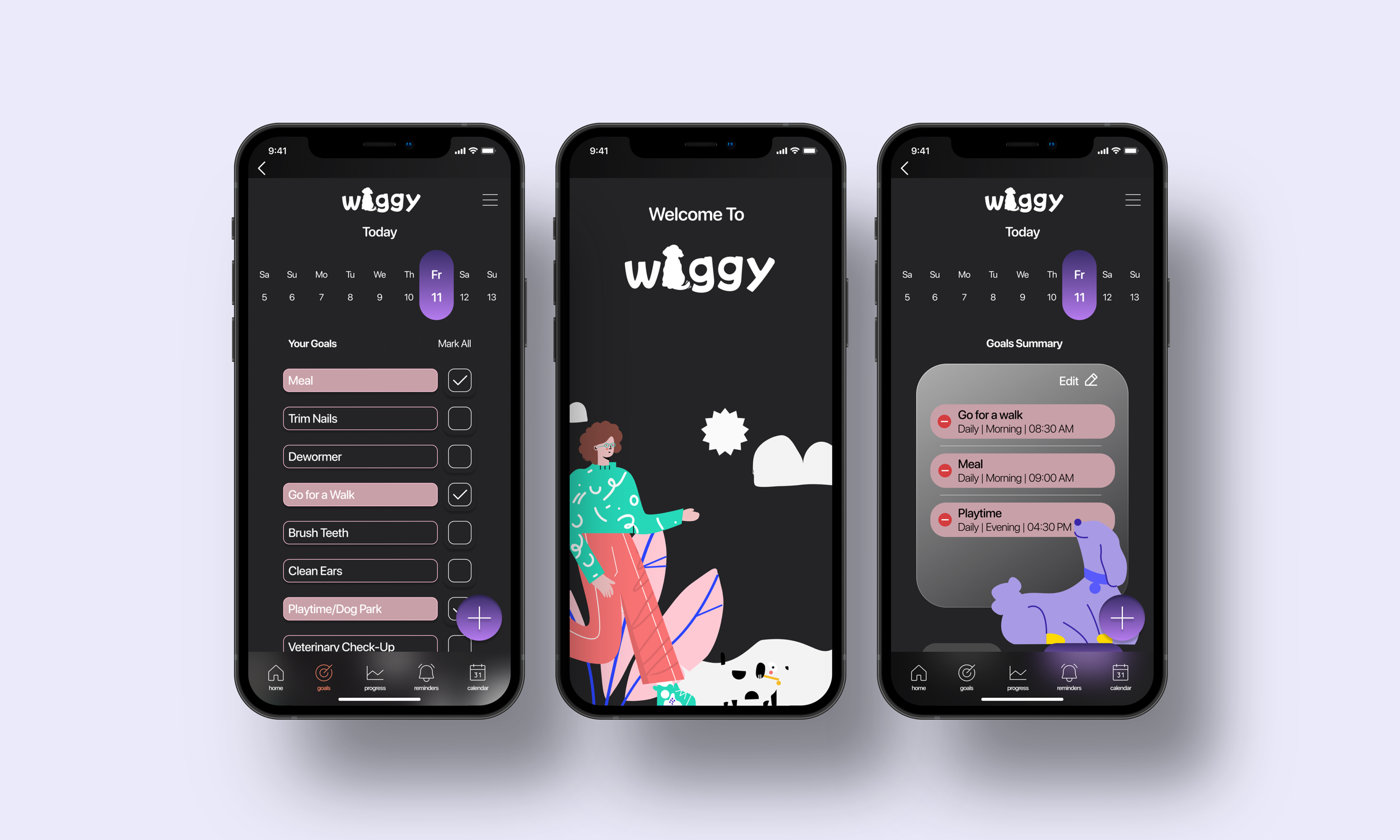
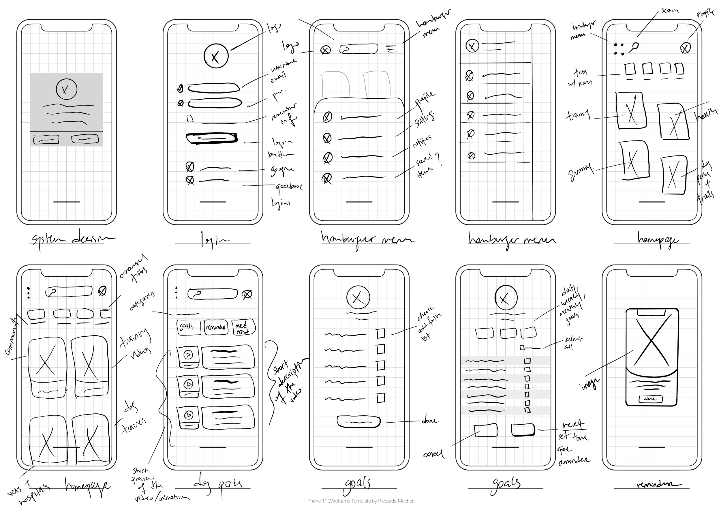
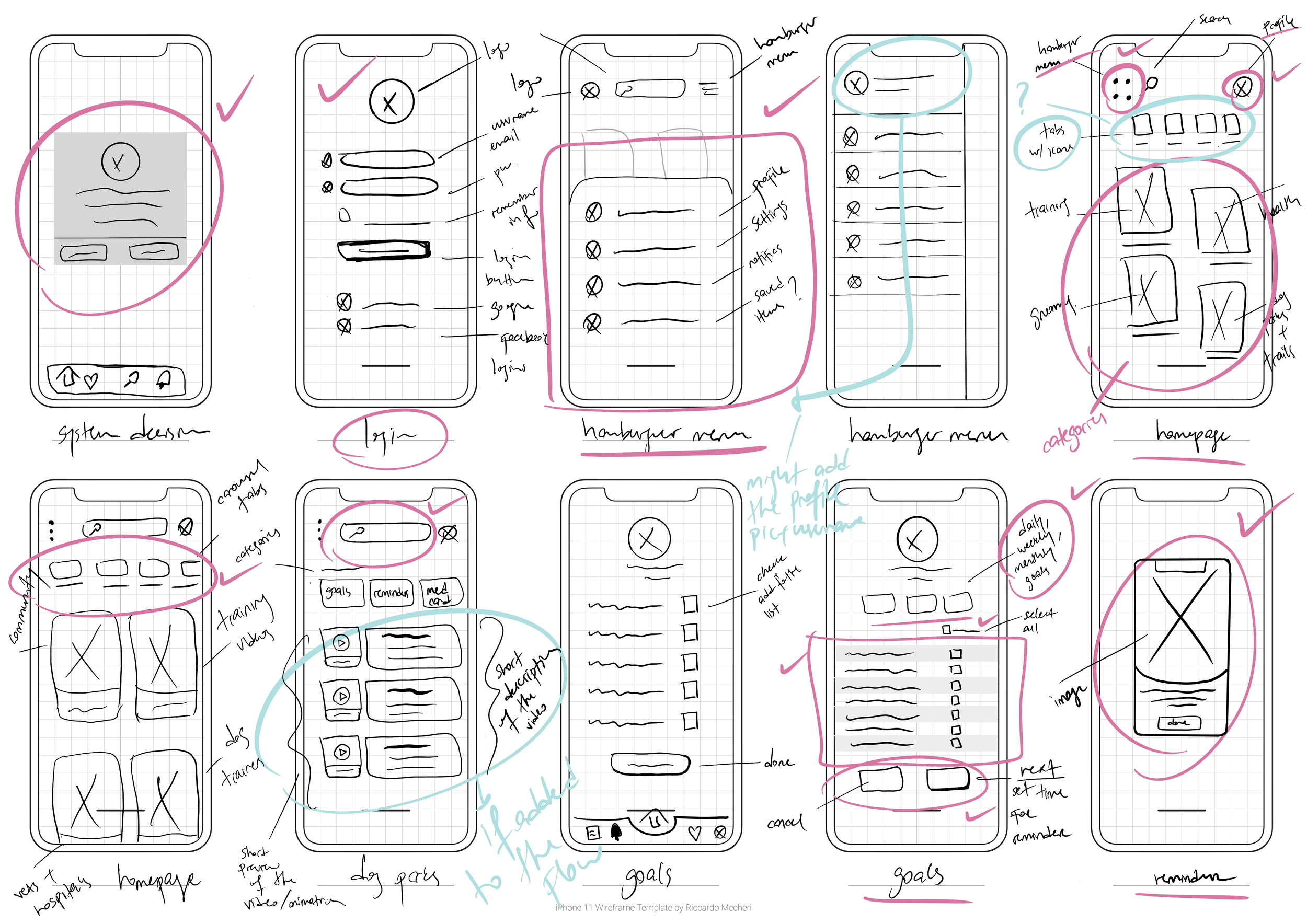
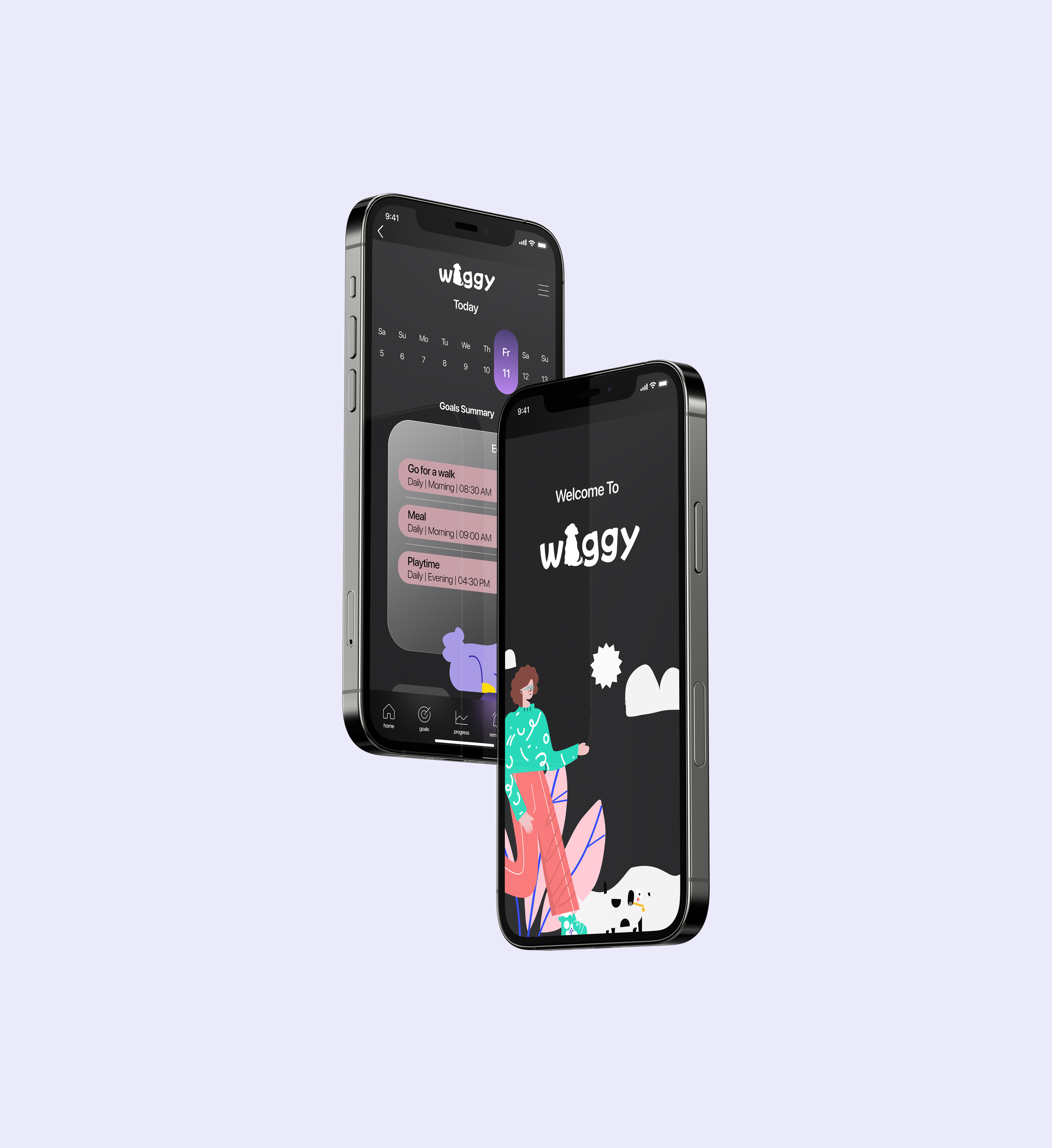
Mid-Fidelity Wireframes
After finalizing my solution sketches, I had a clear understanding of how I wanted my grey-scaled/mid-fidelity screens to look. I designed my mid-fidelity wireframes by using a standard login page, cards, pill tabs, list, IOS system decision, and IOS time picker. Below mid-fidelity wireframes were designed by using the dark mode feature.
-
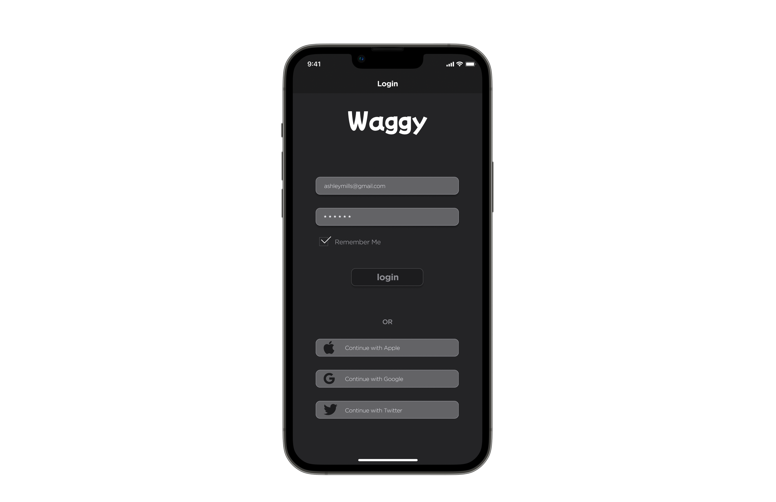
Login Page
-
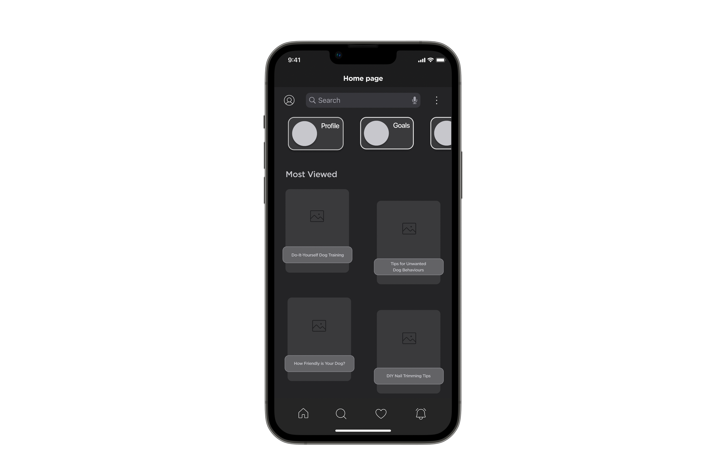
Homepage
-
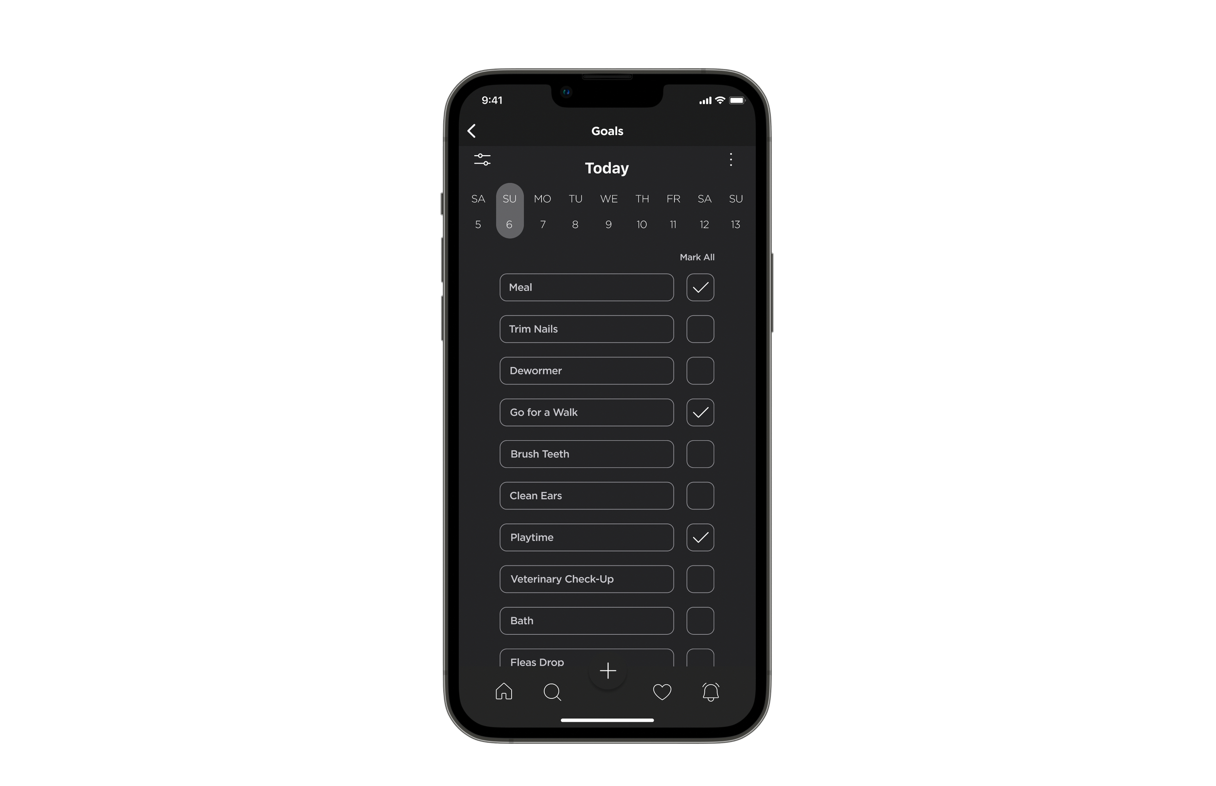
List of Goals
-
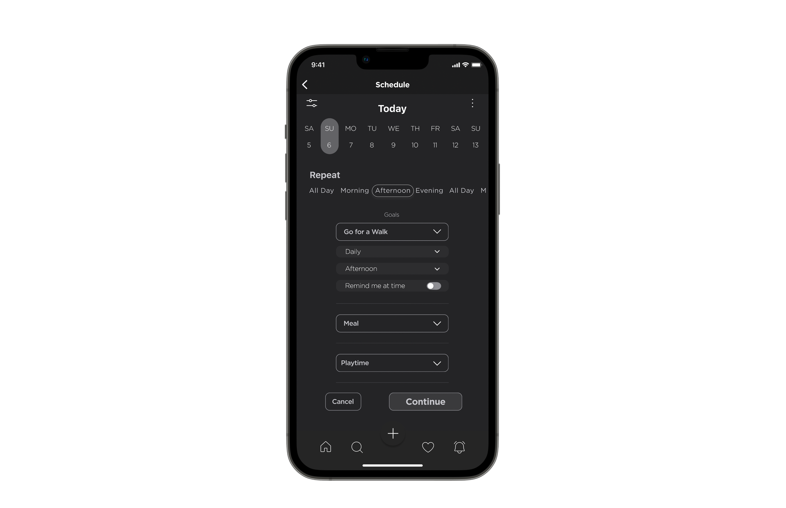
Scheduling Page
-
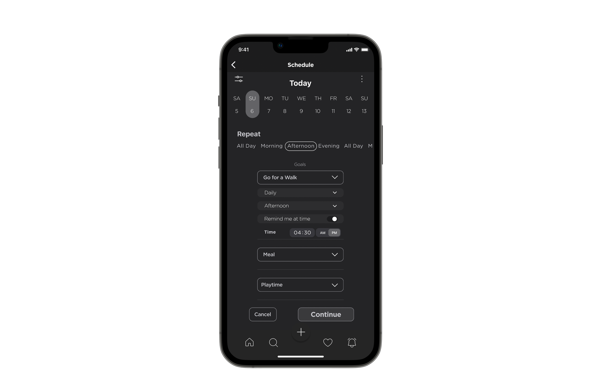
Time Selection
-
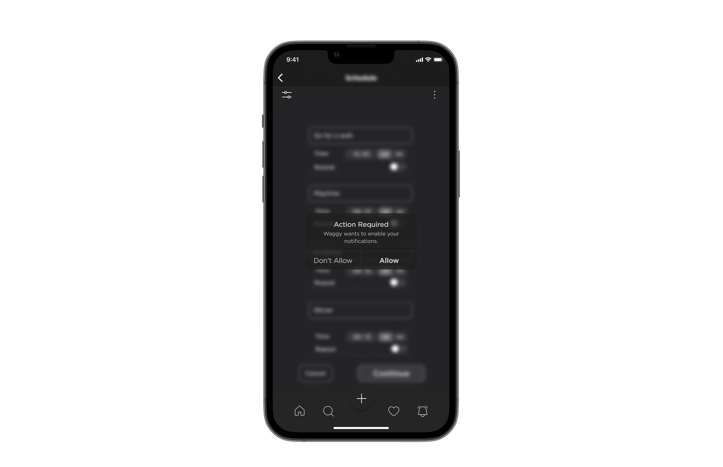
System Decision
-
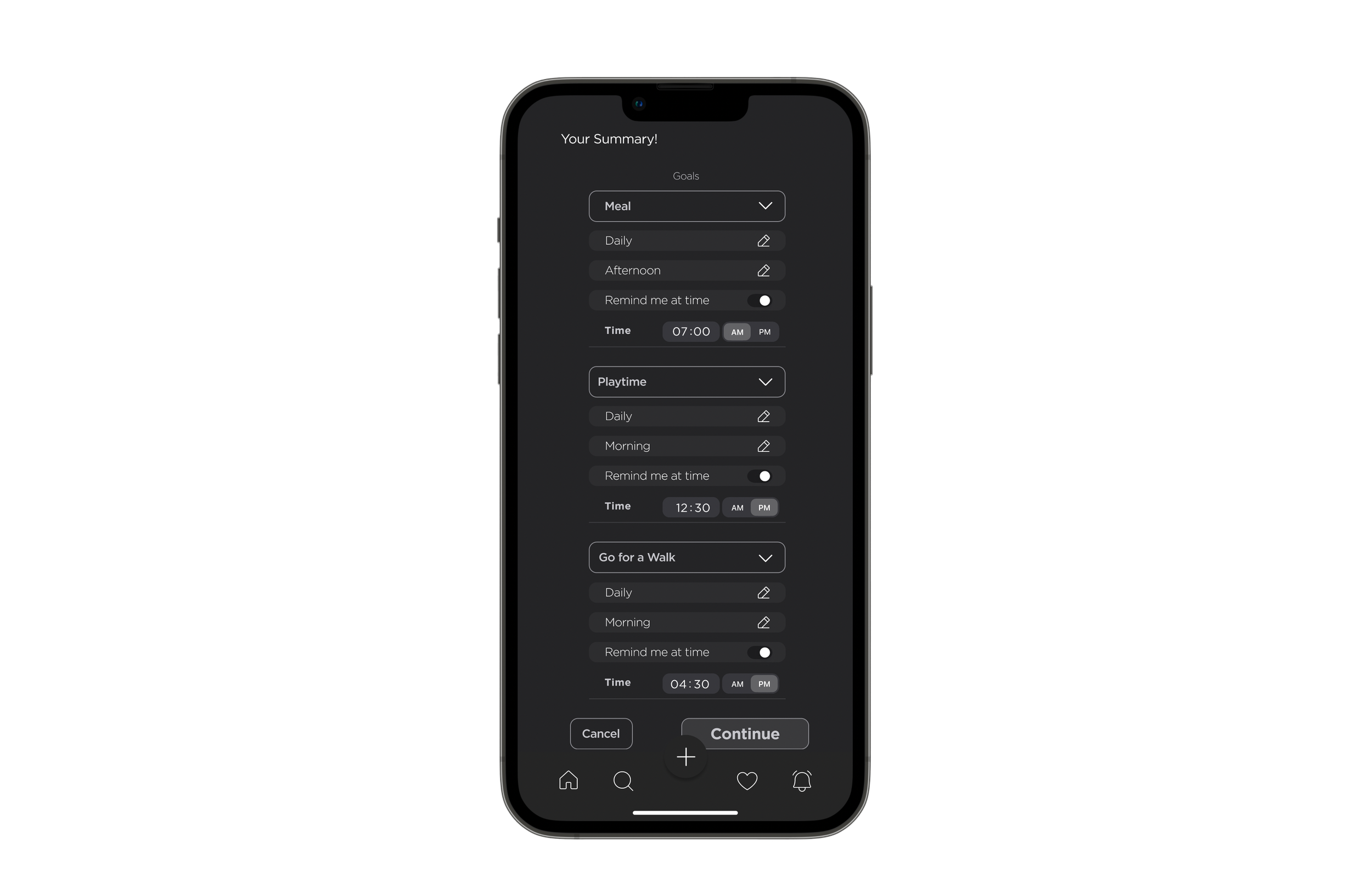
Goals Summary
-
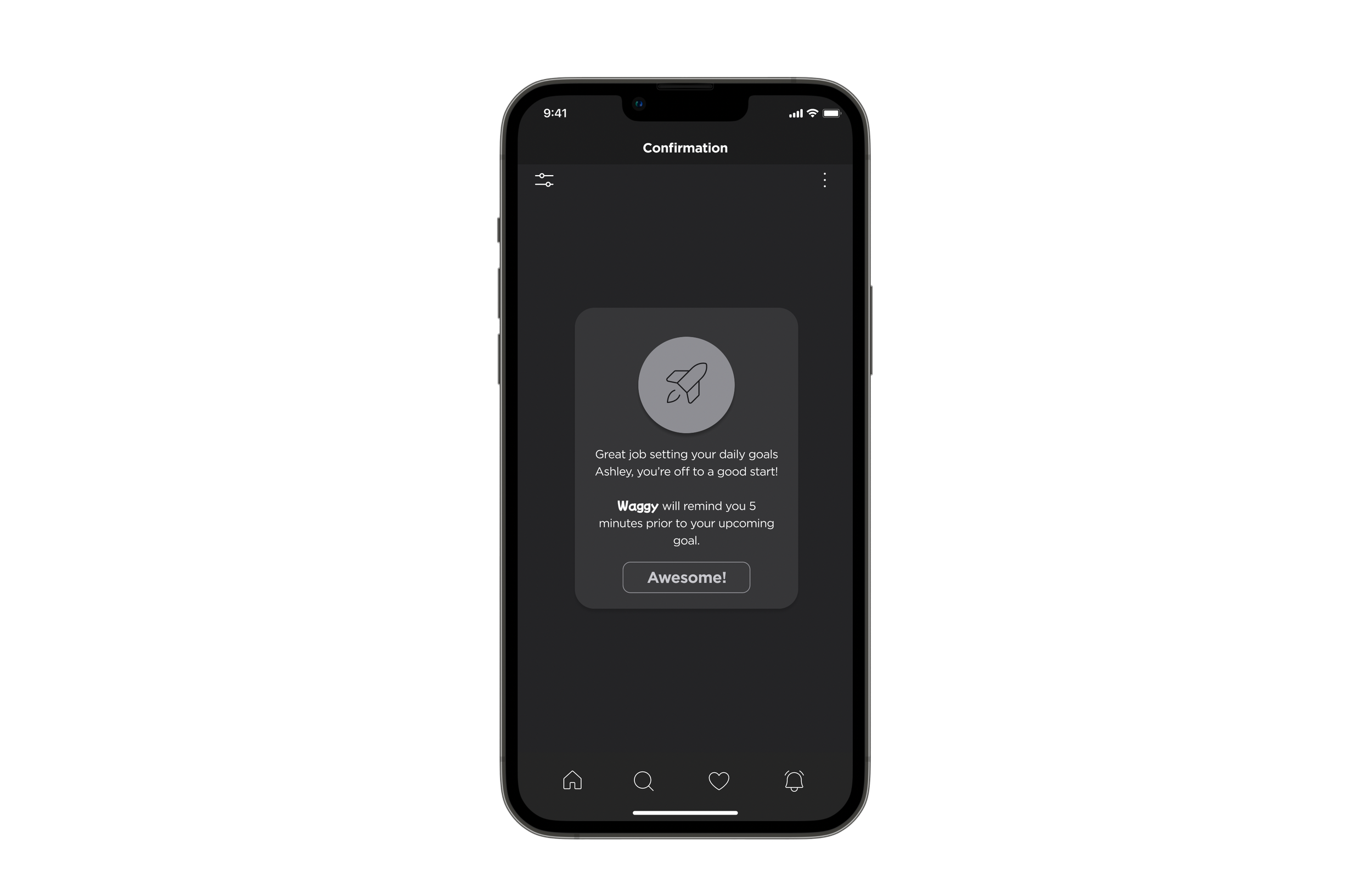
Confirmation Page
-
User Testing
As part of the Waggy design process, I conducted 2 rounds of usability tests with 10 users in order to obtain practical, real-time feedback.
I made it very clear that this test was about testing the product, not the users. And I wanted them to be as honest as possible about their opinions.
8 user user tests were conducted over Zoom and two of them were conducted in-person.
All 10 users were given a simple background script and asked to complete the task.
Script: Imagine that you are a dow owner. You want to give your dog a happy fulfilled life. Therefore, you want an App that you can be on top of your dog’s care routine. Your aim is to set daily goals and receive reminder notification from Waggy.
Task: Sign in to your account - Set daily goals for your dog.- Switch your dogs' account. - Schedule a time for each goal. - Enable to receive in-App notifications. - Successfully confirm your daily goals.
-
User Testing Results
Overall most of my users understood what to do and successfully completed the task flow by following the given background script.
I received very positive feedback from the user testing on the whole, especially on the User Interface being super clean and easy to understand\follow.
-
Area Of Improvement
Most users had issues switching their dog’s accounts. They thought if they were setting daily goals for their dogs such as meal times or taking them out for walks, selecting and switching accounts for each dog did not make sense to them as those tasks could be done at the same time.
-
Solution
After conducting 10 user tests, overall testing results gave me a clear indication of what changes I should be focusing on in order to improve my wireframes.
I removed the account switching action from the task flow and focused on improving my overall design decision aesthetically pleasing for the hi-fidelity wireframes.
-
Brand Development
Here you will see Waggy’s evolution. I defined a colour palette, typography, and designed a wordmark for my brand. These elements were also used to establish my brand within my hi-fidelity wireframes, through the design of an application icon, and a responsive marketing website.
-
Keywords - Long List
Vibrant
Colourful
Joyful
Happy
Loyal
Faithful
Healthy
Gentle
Lively
Friendly
Playful
Calm
-
Keywords - Short List
Colourful
Loyal
Joyful
Healthy
Friendly
Playful
Calm
Happy
-
More A Than B
More playful than serious.
More responsible than adventurous.
More accessible than inconvenient.
More joyful than unsatisfied.
More fun than boring.
More successful than failure.
-
Brand Name Ideation
Happy Wag
Go Pawty
Lolling Tongue
Squeaky
Pawfiction
Pawer
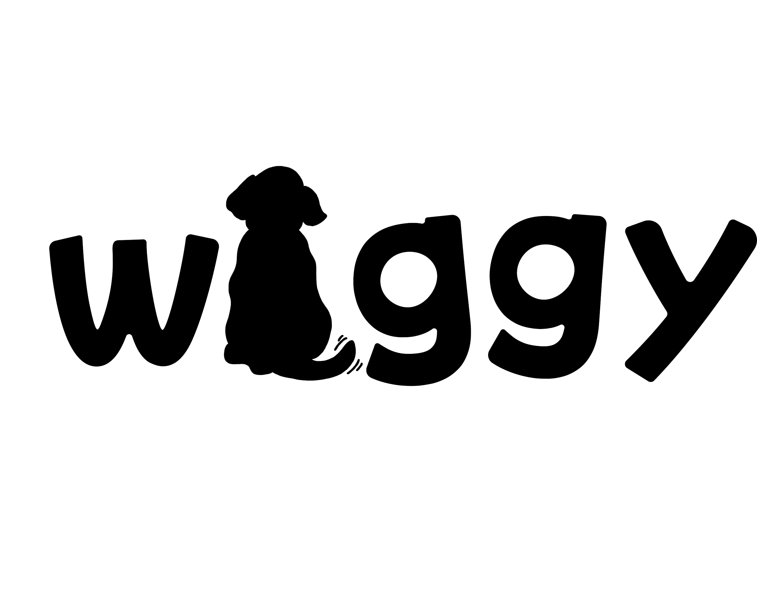
Waggy
Paw This Way
Paw Your Side
Woofy
Wiggle Butt
-
Tagline Ideation
We Paw Your Back!
MVP-O | Most Valuable Pet Owner
A Well Behaved Dog, Who Dis?
Talk the Talk, Dog the Dog
Create Your Own Goals
Wiggly Tail At It's Finest
-
Brand Name Creation
-
Process
My brand’s main focus is to help pet owners build habits in managing and maintaining their dogs’ needs and care. Dogs deserve a happy fulfilled life, therefore my brand was supposed to implement joyful, playful, and yet faithful feelings to shape its identity. Therefore, I decided on Waggy as the Brand/App name with the tag line We Paw Your Back!
-
Why Waggy?
1. Represents a happy dog as dogs wag their tail when they are happy.
2. Gives a joyful and happy feeling to the brand.
3. It is one word and easy to remember.
4. Users can easily understand it is a dog App by its name.
-
Moodboard
After finalizing the keywords, brand name and tagline, it was time to build the moodboard to find the best related photography, color palette, wordmark, iconography and typography for Waggy.
-
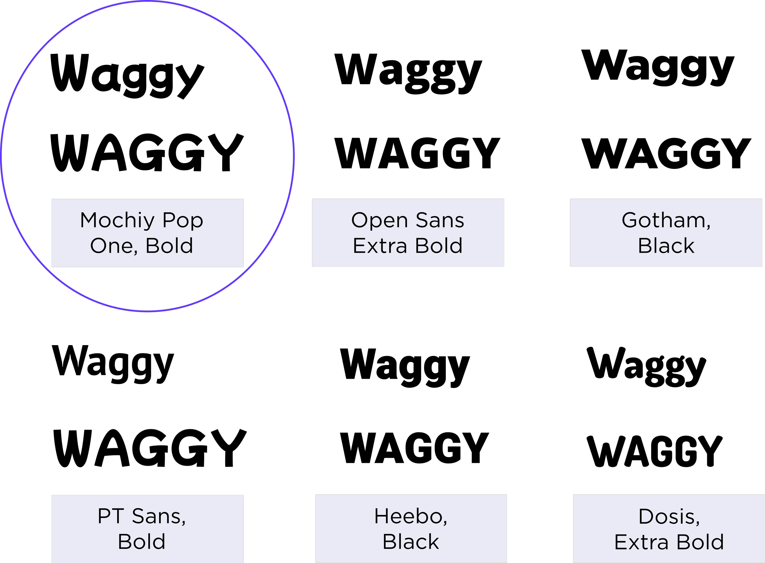
Wordmark
For the initial process of finding the right font for wordmark, I listed some fonts that might give a value to my brand, Waggy.
After listing some possible fonts for the wordmark, I decided on the first option, Mochiy Pop One, Bold as a base font to work on due to its similar identity to the typography inspirations I had in my Moodboard.
-

Wordmark & Brand Logo
Spacing between letters was decreased.
Offset alignment was created between letters to give it a more playful look.
Edgy corners changed to rounded corners.
-
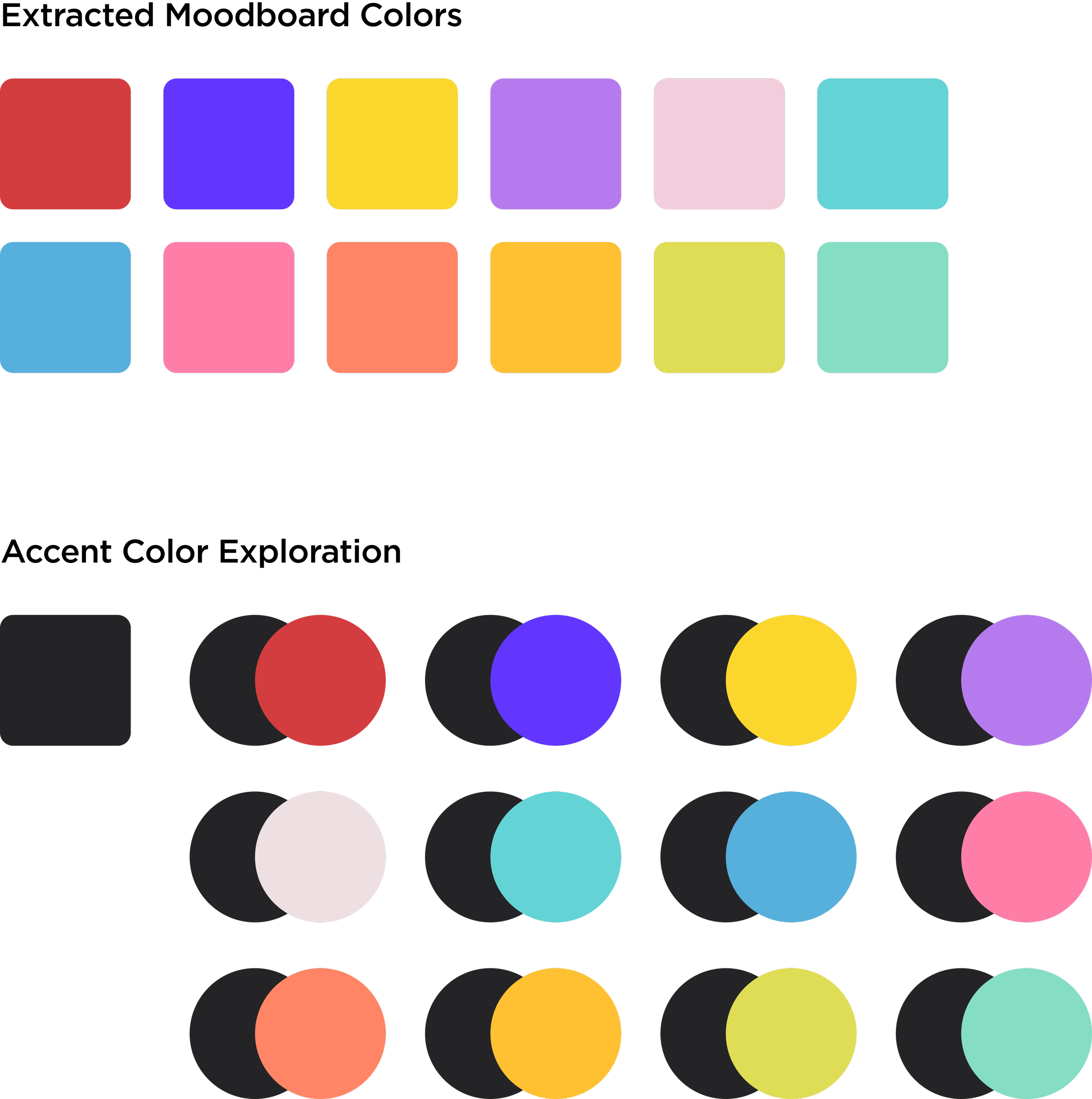
Colour Exploration
In terms of developing the brand colour palette, first, I extracted some colour swatches from my moodboard. Then, I picked a brand colour and started pairing with extracted colours I had in my moodboard.
-
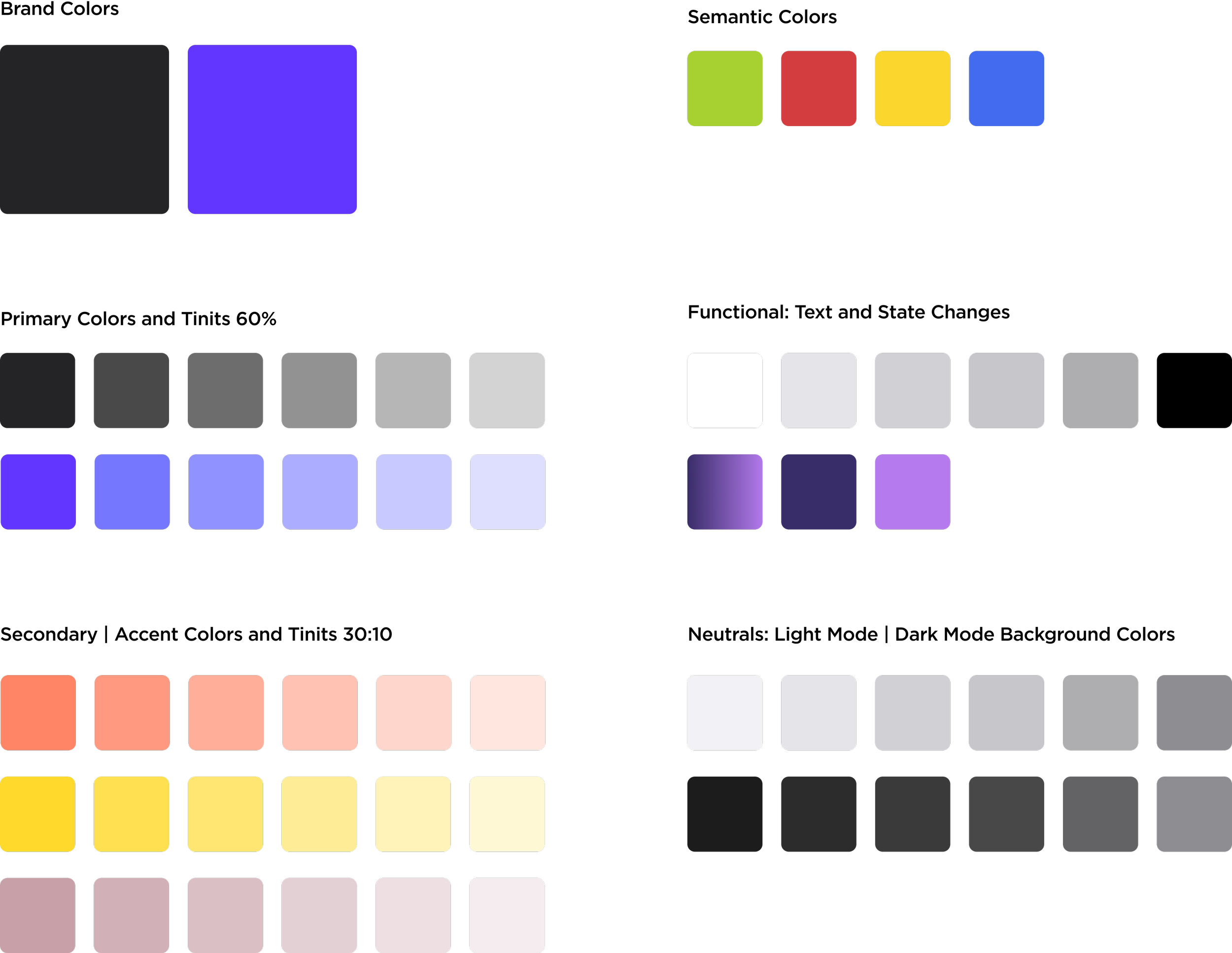
UI Colour Library
Upon choosing the primary colour and discovering possible pairings, I built the UI colour Library that includes secondary and accent colours with tints as well semantic colours, functionals and neutrals.
-
Prototype
You can view the final hi-fidelity wireframes with an interactive prototype by clicking on the button below.
In order to provide you with a smooth experience, I’d recommend you to follow the simple steps listed below.
-
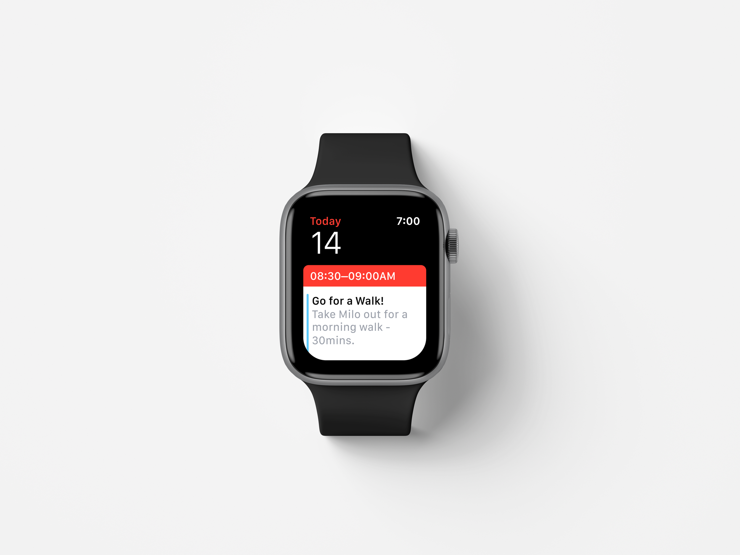
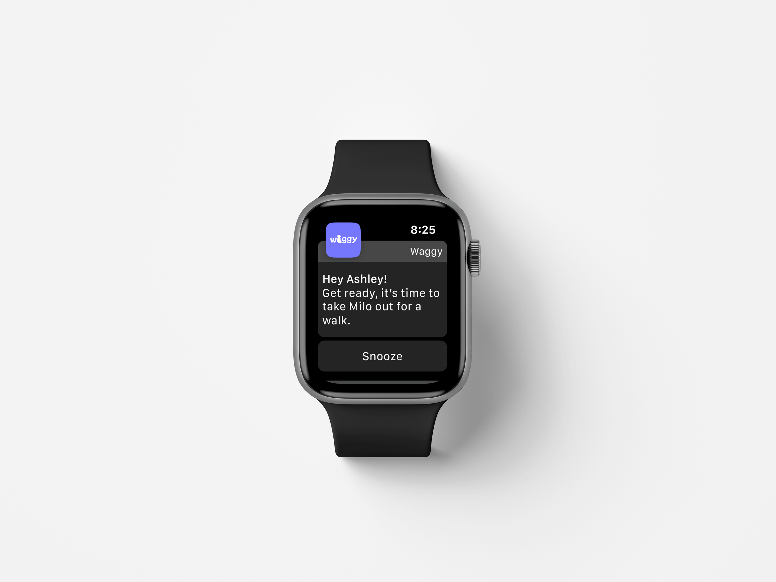
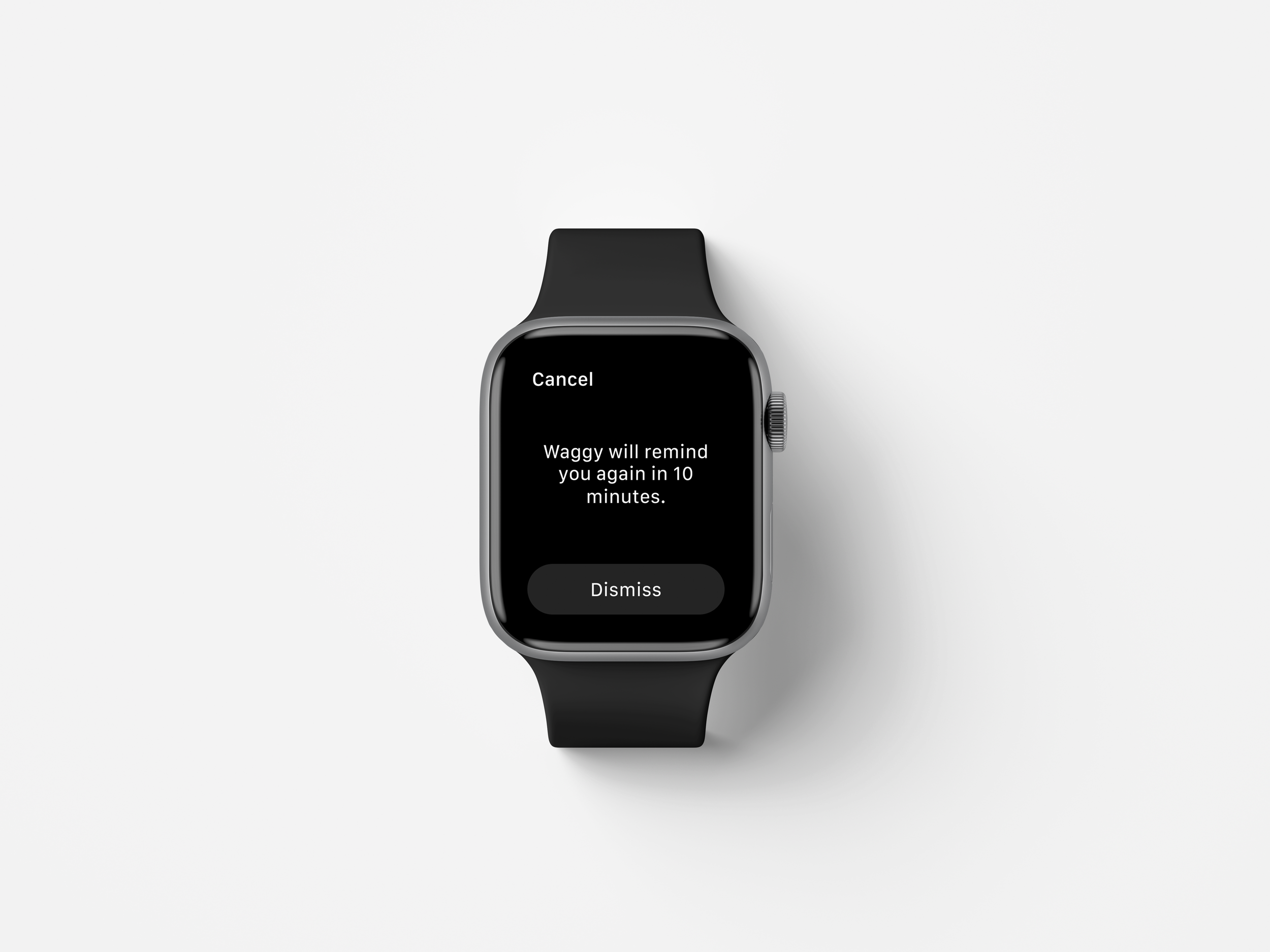
Multi-Platform Challenge
For this unique challenge, I revisited my persona, task flow and user stories to figure out their goals and motivation. While I was reviewing my persona, I noticed Ashley’s quote. She was saying “I want an App to set my daily goals and receive reminder notifications so that I can be on top of my dog’s daily care routine.” This was the perfect opportunity for me to build my secondary task flow and see how this application could be used in a different platform other than desktop and mobile.
Since Waggy’s demographic reflects on professionals aged between 25-45, I had to come up with a platform that provided maximum efficiency and easy communication to the app users . Therefore, I chose Apple Watch.
By using Apple Watch, users would be able to check their daily, weekly, monthly or even yearly goals from their calendar, and receive in-app reminder notifications with the ability to snooze them.
-
Future Plan
I would like to add a few more features to my app which include (1) a community channel where dog parents can share their experiences, tips and tricks with other dog parents, (2) ability to keep dogs’ medical records so that users wouldn’t need to call their vets every time they need a document, (3) a progress bar that shows users’ achievements, (4) live Q&A sessions with veterinarians across North America where dog parents will get to ask questions about dog care in general.
-
Key Learnings
I learned many things from this case study over the past 2 months. During the research and user testing process, I realized that users have differing expectations on the design, flow, and functionality of my product. I stumbled upon a very applicable quote on the Internet about this: “You cannot make everyone happy because you are not pizza.” While this quote is funny, it speaks accurately to my experience in this project. While many users have differing expectations for how a product should work, it is the designer’s job to filter out these expectations and create a functional product that is still human-centered and accessible.
Overall, seeing the final result of my product was really rewarding.